Showing posts with label Victorine. Show all posts

Sunday, June 29, 2014

Glittery Christmas

Isn't it funny how there are techniques you know how to do, but you just never bother to try them? It wasn't anything amazing, but I've never before just put down a strip of double-sided tape and sprinkled it with glitter to create a ribbon of glitter. It's kind of a nice effect.
I also used a glittery embossing power on the tree because Holly Jolly Christmas wants to see lots of glitter in the current challenge. I was going to try to enter this in Sarn's Rudolph Challenge, but I don't think I have two Christmas cards in me right now
Details:  The Christmas tree stamp is from Victorine Originals, the sentiment for Another Stamp Company.  The paper are all from a Echo Park stack, where I am using up snippets.  The white EP is called Winter Wonderland, from Stampendous, purchased either at Hobby Lobby or Mikes. 
The sketch is from Papertake Weekly Challenge. I went back into their sketch vaults and used Sketch 79.

I am entering the card in these challenges:
Holly Jolly Christmas: Lots of Sparkle
Papertake Weekly Challenge: Sketch Free-for-All
Simon Says Wednesday: Anything Goes
Pixie's Snippet Playground #131 -- snippets
Word Art Wednesday #138: Anything Goes.

Tuesday, July 30, 2013

Going for a ride

I love bike riding and now that DH has a new bike, we're trying to go biking a little more.  So I thought I'd have some fun with this bike image from Rubbernecker Stamps. I used the current Sketch Saturday sketch (#269) for the layout.

The biker is black-embossed on a pale blue card stock.  I used the "out of the box" (or, in this case, out of the circle) technique when die-cutting, so my biker is popping out of the mats. I also added eyelets to the center of the wheels -- an old trick but a fun one that adds a little interest and color there to the center of the main image. And since I have a lifetime supply of eyelets, I used a few to hold the sentiment in place as well.

The background paper is some of my favorite summer paper -- the colors just look like summer and the striped one reminds me of a beach towel.  That qualifies this card for Victorine Originals challenge #64, to use summer colors.

Tuesday, July 2, 2013

The old red, white, blue

I shy away from doing red/white/blue color combos because I associate the combo with flags, but I decided to try making a non-patriotic card with that color combo.  I'm pretty happy with the results.

I used Feeling Sketchy #64 for the layout. Even though there are a lot of elements, everything seemed to come together easily for this one.  The image is from an old Stampin Up set, Country Morning, that I  got at a consignment sale. I've always liked these little bouquets but I don't think I'd actually inked up this image before.  Blue glass jars and red and white flowers seemed just right for this.  The image is stitched on a navy panel (and for once the sewing machine didn't act up on me. Yay).

The partial circle is embossed with dots to add a little dimension to that side of the card, and the flower image is up on pop dots, both for dimension and to accommodate the ribbon tabs. 

I am also entering this card in Victorine Originals challenge #62, to make a red/white/blue card.


Friday, June 14, 2013

Enjoy the ride

I love this image of a frog on a Vespa.  How cute is that?
The image is colored with pencils, and there's glitter pen on the chrome parts of the bike, as well as on the wings of the little bug hanging onto froggie for dear life.  (Like I said, how cute is that?)
All the images on this card are from Paper Cupcakes, which sadly closed up shop about a year ago. I did a guest designer stint with them, so I have several iamges and they are all quite cute.

I am entering this card in several challenges:
Feeling Sketchy -- sketch 62
Simon Says Stamp -- transportation (Vespa)
Victorine Originals #61 -- animal or insect (I have one of each)
Stamping for the Weekend -- Cute (we've established this is a cute image, right?)
Simply Create Too, #39 -- masculine card
Tammy's Scraping Corner #66 -- Masculine card

Tuesday, June 4, 2013

Masculine card

I made this masculine card as a father's day card.  I got the image as an RAK, and someone did a lot of work on it, because that image is repeatedly masked and stamped. I was happy to feature it prominently. But I can't tell you who made the image or what color ink it was stamped in (black or dark brown).

To enhance the masculinity of the card, I also created a faux leather background (I was a little sad so much of it got covered up -- I love the results of this technique.).  A row of eyelets seemed like a good way to embellish this -- they always seem masculine and vaguely Western looking,

I'm entering this card in several challenges:

Clear It Out Challenge:  Male card, use metal from stash (my metal is eyelets. I have a lifetime supply and am always happy to clear a few out of the stash).
Victorine Originals #60: Father's day/Masculine
Tammy's Scrapin Corner #65: Add texture (the faux leather is dry embossed)
Simon Says Stamp: Anything Goes
C.R.A.F.T Challenges #209: Father's Day/Masculine.

Thursday, February 21, 2013

Black, white and yellow

I know that black, white and red is a "can't miss" color combo, but I am just now beginning to appreciate the possibilities of using black and white with yellow. I used that color combo for this card, which is for Victorine Originals Challenge #53, to stamp, emboss and embellish a card.

The stamps are from Autumn Leaves, inked in Colorbox Chalk yellow cadmium and Memento black.  The yellow panel is embossed with the Swiss Dot Folder.  For embellishment I used a border punch on the bottom of the flower panel mat, ribbon around the flower panel, and three half pearls.


Monday, December 10, 2012

Non-traditional Christmas colors


What’s Christmas without traditions? Well, it’s the premise behind a lot of card challenges, for one thing.  Black and white is certainly not a traditional Christmas color scheme, so I think this card is non-traditional in anyone’s book.

The ornaments (both from Stampabilities) were silver-embossed on black paper, then cut out. They are “hung” from tinsel cord and popped up. The sentiment is also silver-embossed.

I’m entering the card for three challenges:

52 Christmas Card challenge to use Black, White and Metallic as colors.
CAS-ual Fridays CFC81  to make a card incorporating Knots.
Victorine Originals #49 to make a Christmas card with non-traditional colors.

Sunday, December 2, 2012

Little ice skater

Not to rub it in, but there is one nice thing about living in the South.... you can be making an ice skating card secure it the knowledge that right outside your window it's sunny and in the 60s.

I tried a new technique on this -- adding glitter to an embossed piece (just spread it on with a brayer). I must say, it really adds a snow-like sparkle, although I'm afraid it might not show up very well in the photo.

This card is going into several challenges:

There's Magic in the Air -- Sparkle and Glitter
Victorine Originals #48 -- Blue and White
365 Cards #272 -- Wintery with patterned ribbon.

The cute snowman is from Impression-Obsesson.  The snowy DP is from Hobby Lobby, I got it last year after using up the pieces I bought the year before. I hope they still have it as I love both the color and the print.

Sunday, November 25, 2012

Ultra hip Christmas


Yesterday my husband had on a Sirius Radio station that I think was called "ultra hip Christmas," and the music was all stuff that sounded like it was from the late 50s or early 60s, so I guess it was ultra hip back then. This image from Alley Way Stamps sort of has that same retro feel to it, so I chose it for the current Inspiration Challenge #16 at The Alley Way Stamps.  You can see the inspriation comes from the colors of the inspiration photos, espcially the stockings and Santa's elves.

This is also for the Holly Jolly Christmas challenge to include "Three Rs" on your card.  My Rs are Red, Rhinestones and Rounded Corner.

Finally, this is for Victorine Originals Challenge #47, Anything Christmas.

In addition to digis from TAWS, I used rhinestones, paper ribbon from K&Co., colored pencils and OMS, and a corner rounder.


Monday, July 16, 2012

The good old summertime

I was nosing around a thrift store the other day when I came upon a baggie that appeared to contain some intriguing little gift cards and envelopes. Since the price marked on it was 25 cents, I figured it was worth the gamble to buy it.  It ended up being a really nice score.  Along with the vintage-looking cards (with a copyright of 1995 on the back, so they are only vintage-looking, not really vintage), there were also some cool stickers of vintage-era seed packages. 

The illustrations on most of the cards are portraits, but I loved this one I found of sunflowers, and it made the perfect image for a summery card.  I used Card Positioning System sketch CPS 274 in making this card.

I cut the back of the sunflower card and centered it.  Since it has such a nice vintage feel, I wanted to keep the card sort of country vintage looking. I used bakers twine and a vintage button, along with a snip of ribbon that repeats the sunflower motif.  Swiss dots always add a nice vintage feel, so I embossed the upper layer with that folder.  The script "summer" stamp is from Purple Onion Designs, and is stamped in Colorbox Chalk Chestnut Roan ink.

This card is also for the current Really Reasonable Challenge (RRR52), to showcase summer colors. I'm also entering it in Victorine Originals challenge #38, to use ribbons and buttons on a card.

Sunday, July 15, 2012

More fun with paper

This card was created for a girl who loves giraffes.  Luckily, I found I had paper that featured some fun giraffe images.  It's a set from DCWV called Kids Safari.  I used a glittery giraffe image and a pink paper that is a giraffe skin print that has little silhouettes of a giraffe image worked in. How perfect is that?

Along with the papers, I used a wide ribbon, and a little fish-tail banner with the sentiment. Sentiment is stamped in Colorbox Chestnut Roan and set off by a little button.

The sketch is from 365 Cards, #130.  It's also for Victorine Originals challenge #38, to use ribbon and buttons on a card.

Wednesday, June 27, 2012

The paper is the star

The focal point of my cards is almost always a stamped image. I guess I just think of myself as a stamper, but I rarely highlight the paper or embellishments on a card, but rather use them to enhance the main image.  Today's card is different. It's all about the paper, which in this case is from Cosmos Cricket.

I saw this sketch from 365 Cards  (challenge 116, Sunday Sketch) and knew right away which papers to use.  The card came together very quickly, and I even had some fabulous trim to use on it.

The card is also for the current challenge at Victorine Originals (#37) which is to create a Happy Birthday or Happy Everything card.  I honestly thought I had a stamp that said "happy everything," but sadly I couldn't find it. This sentiment from Club Stamp is the same idea, however. Yes, the sentiment is intentionally at an angle, because the lines on the graph paper wouldn't have lined up properly.

Tuesday, June 19, 2012

Watercolor pear

Some stampers keep a file of UFOs (unused flat objects), which is where those images you stamp, maybe even color, but don't end up using, find a home for a long, long time. That's where this pear has been living for quite a while, but it worked perfectly for this layout.  The sketch is Card Patterns #170, and I am also entering this for Victorine Original's challenge #36, which has the theme of "Anything goes".
To create the pear, I scribbled on the stamp with watercolor crayons, spritzed the stamp with water, then stamped on watercolor paper. I use the word "scribble" but it wasn't random; I put the colors where I wanted them to be to give the pear the look I wanted.
As you probably know, watercolor is bright white, so when I decided to go with this paper, I sponged around the pear with Versacolor "Bamboo" ink to tone it down. (I sponged a white Prima with the same ink to create the matching flower).
The papers are all from a K&Co. stack called Bungalow.
Other supplies: Jeweled brad, ribbon, piercing tools, birthday sentiment.
Truth be told, this is a lot more color than I usually work into one card, and it's a little scary for me to use that much color.  I do like how it came out -- hope you do too.

Friday, May 11, 2012

Flowers, flowers everywhere

     How many floral images do you have? I have no clue how many I have, I just know I am drawn to them and have to remind myself that I have plenty of flower stamps when I see another I like. I also like floral printer paper and flower embellishments, so the Victorine Originals challenge #33, with the theme of '"flowers" seems like it was made for me.
      I started with floral paper for the base card. For the central image, I inked up the flower with Colorbox Chalk ink called Cadmium Yellow and stamped it off once on scrap paper before stamping it, so I got a lighter image. I overstamped with the sentiment in black Memento ink and sponged the edges around it with a greenish color called Bamboo. All the papers are from a Making Memories stack called Sydney.
     For the embellishment, I used  two layers of gauzy flowers under the paper flower both to make it fluffier and so the green of the gauze would be evident.  They are attached with a mini brad.

Friday, March 9, 2012

Not a shamrock in sight

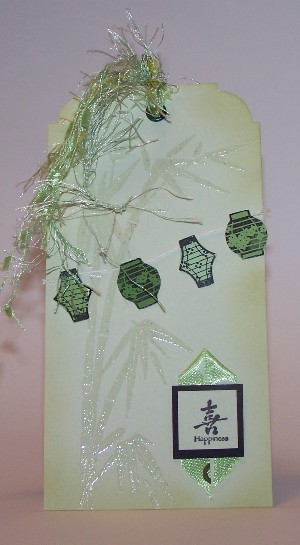
This tag is for two color challenges, the Monochromatic Green at Really Reasonable Ribbon (RRR43) and Green, White and Black at Victorine Originals (VO29).  I know when someone suggests green cards in March, you're supposed to do St. Patrick's Day, but I have no appropriate images and don't really get inspired by leprechauns (no offense to those who do -- I have seen plenty of fabulous St. Patty's Day creations!).
I decided to make an Asian inspired tag instead. The images are from Hero Arts and Inkadinkadoo. 
The bamboo is clear embossed on the green tag. I stamped the lanterns on a multicolored paint chip (so I could get several greens that worked together), cut them out and strung them on baker's twine.  The symbol/sentiment is matted on black and placed on top of a piece of ribbon that I folded into a point. The black ink is StaZon on the lanterns and Memento Black on the other. The edges of the tag are sponged with Versacolor Bamboo ink.  I added a green eyelet and tied a variety of green ribbons and fibers to it.

Tuesday, February 28, 2012

Life is a beach

This week's Card Patterns Sketch (#154) inspired me to do a simple beach theme.
The images are both from Impression-Obsession (I'm 90 percent sure). The larger one is embossed with Winter Wonderland EP, which gives it a nice sort of sparkle, like sand in the sunlight.
The smaller is stamped with Chestnut Roan ink, which is also sponged around the edges of the oval.
The blue strip actually has a linen texture, so it's a little more interesting in person.  The ribbon matches the paper quite well and provides a nice feminine contrast for the kraft paper and brown ink.  It also qualifies this card for the current Victorine Originals Challenge (#28), to use lace on your card.

Friday, January 27, 2012

Inspired balloons


Paper Cupcakes inspiration photo
      This week's challenge at There's Magic in the Air asks us to be inspired by this bright and cheerful photo. I loved the greens and purples and wanted to be sure to incorporate them into this card.
     I even found a Paper Cupcakes image that works well with this inpiration. It's called (surpirsingly enough) Balloons with Envelopes.
     I used this week's sketch from SCS, and there's nothing that needs explanation on this card.
     The details:  Image by Paper Cupcakes; papers by Martha Stewart.  Image colored with pencils and OMS.  Accessories include Beads in a Bottle, decorative-edge scissors and skinny ribbon.
     I'm also entering this in the current Victorine Originals Challenge, which is "anything goes,"  so I'm pretty sure this qualifies.

Thursday, January 12, 2012

Cleaner technique

      That's cleaner as in "I used a cleaning product" on it, not that it has less dirt than the average technique.
      The card began its life several weeks ago, when I tried to do a Virtual Stamp Night challenge to use the salted background technique (apply reinker to glossy cardstock, spritz with water and sprinkle on salt). I wasn't pleased with the results, so I washed off the salt and spritzed the inked background with spray Lysol cleaner, which creates a wonderful splatter background. I've only tried a few cleaners on this technique, but I don't think any particular brand is needed. It's probably some basic ingredient in spray cleaners that works its magic this way. If you have some other brand, try it and let us know if it works!
      The resulting design on the paper reminded me of a snowy night, hence this card.  I stamped the tree, then used a white gel pen to add the accumulated snow in the branch joints.  The sentiment features a TJ tecnhique called spirelli -- I found embroidery floss that matched the purple paper and used two strands to get what looked like the perfect weight for that technique.

      The layout here is the sketch that is current challenge at Victorine Originals (VO25).

The details: Trees by Posh Impressions; Sentiment by Hobby Lobby. White gel pen, embroidery floss, Oval and scalloped oval nesties.

Wednesday, December 14, 2011

What's Christmas Without Glitter?

     I'm not much of a glitter girl, but one of the VSN challenges this weekend was to do a panel covered in glitter. I decided to make my panel angels in a glittery sky.
     The card is based on the current Card Positioning System sketch (CPS248), which called for three stacked elements, so I just stacked the angels (unknown maker).  They are colored with pencils.  I used a thin two-sided adhesive film for Thermoweb to cover the panel, then added a light blue glitter. That panel is matted on navy paper, and the sentiment (from Serendipity) is in Night of Navy ink. Clean and Simple, it's as easy as that.
      I'm also entering this to the current Victorine Originals Challenge (VO23) to make a Christmas card.

Thursday, December 1, 2011

Vintage Christmas

     I wish could get as enthused about other aspects of getting ready for Chistmas as I can get interested in making Christmas cards. Things would go a lot easier that way.
     Today's card is a vintage-style Christmas card. The vintage aspect was inspired by this week's Magical Monday Challenge from Paper Cupcakes/There's Magic in the Air.  It's also based on the current Card Positioning System Sketch (CPS246).  And it uses ribbon, qualifying it for the current Victorine Originals Challenge (VO22).
     The old-fashioned Santa is stamped on white paper, colored with pencils and OMS.  There's a little  glitter pen on the ribbon on the wreath and silver gel pen on the jingle bells up the cneter of his coat. Edges are sponged with SU Creamy Caramel ink.  Image is mounted on  maroon paper that has been run through the Cuttlebug (textile plate) and came from the scrap file.  I wapped gold cording  around that with a little Chirstmas stocking charm hanging from the cording.  I added gold ribbon tabs at the top of the matting, which is popped up on popdots. I also sponged around the edges of the cream-colored card  and did faux-stitching around the strip of old-fashioned holly DP in maroon marker.

Musical birds

 Sometimes you find the perfect patterned paper for an image. I think that happened with this card. I wanted to use this IO image of birds o...

Popular Posts