Rubber stamping, stamping, papercrafting and other projects from a writer by trade, stamper by passion.
Wednesday, December 12, 2012
Pierced frame
Pierced frames are a quick and easy way to add interest to a card. To create the frame for this image, I just cut a scrap piece of paper to the size I wanted, then used a corner rounder on the edges to create an interesting shape. Use low-tack tape to hold it in place and pierce around it.
Olive green and red is a little twist to the traditional Christmas colors, making them look a little more contemporary and fun. Red and green are complementary colors, or opposites, so this is being entered in 365 Cards challenge #285, to use "opposite colors."
The tree is a die-cut sticker. Actually, there were three slightly different versions of the tree on the sheet of stickers, so I made three versions of this card, because I think it's fun.
Tuesday, December 11, 2012
a more elegant Christmas
White-on-white embossing always strikes me as quite elegant, and I hope it adds a touch of that to this card. I added a few pearls to increase that feeling.
This card is based on this weeks sketch for 365 Cards, #284.
The ornament is an extra from a previous card I made. I silver-embossed the sentiment and cut it out with nesties. (My standard "Merry Christmas" stamp was an old cheapie. It wasn't stamping properly and I thought it was warped so I decided to unmount it. It literally cracked and fell apart while I was trying to get it off. I guess the rubber had dried out. That has NEVER happened to me before, and now I have to head out to find another one).
I used the textile embossing folder to give the background a little dimension and a pattered ribbon to add a little more color.
Monday, December 10, 2012
Non-traditional Christmas colors
What’s Christmas without traditions? Well, it’s the premise behind a lot of
card challenges, for one thing. Black
and white is certainly not a traditional Christmas color scheme, so I think
this card is non-traditional in anyone’s book.
The ornaments (both from Stampabilities) were
silver-embossed on black paper, then cut out. They are “hung” from tinsel cord
and popped up. The sentiment is also silver-embossed.
I’m entering the card for three challenges:
52 Christmas Card challenge to use Black, White and Metallic
as colors.
CAS-ual Fridays CFC81 to make
a card incorporating Knots.
Victorine Originals #49 to make a Christmas card with
non-traditional colors.
Sunday, December 9, 2012
Splattered and tied
The COTM theme for a group I'm in is "paint splatter technique." Calling this a technique is a bit of a stretch, since all I did was mix a little water and reinker, load up a paint brush, and flick it. I guess it makes an interesting background -- easy enough to do, and you could make bg paper any combo of colors you wanted to.
The tree is embossed with a glittery white EP called Winter Wonderland. It looks quite glittery in real life.
I used a scrap of the paint-splattered paper to make a tiny tag for my sentiment, and a scrap of embroidery thread
The card is for 365 Card challenge #279, to use gingham. I think the gingham ribbon goes will with the casual look of the paint splatters.
Tuesday, December 4, 2012
For all the Whos in Whoville
A few weeks ago, the Technique Lovers Challenge at SCS was making a folded tree. Couldn't be simpler -- you take half a circle and put three folds in it, and you're done. I made several of them that day, figuring they'd be useful on Christmas cards.
Sure enough, those trees are proving handy to have around as I make Christmas cards. This one fit perfectly into this week's sketch at 365 cards #277.
There's something about the trees I made that makes them look a little Seussical. I think they'd be perfect for Cindy-Lou Who, don't you? (Actually, I suspect they would also look quite elegant if done in an embossed white, and I need to try that). I happen to have a pad of Christmas dp someone gave me that also has that sort of Seussical feel to it. Personally, I like my Christmas stuff traditional, so I've been struggling to use this paper in ways I can live with. I think the little Whoville tree card with the whimsical circles and squares on the dp actually works pretty well together.
Sunday, December 2, 2012
Little ice skater
Not to rub it in, but there is one nice thing about living in the South.... you can be making an ice skating card secure it the knowledge that right outside your window it's sunny and in the 60s.
I tried a new technique on this -- adding glitter to an embossed piece (just spread it on with a brayer). I must say, it really adds a snow-like sparkle, although I'm afraid it might not show up very well in the photo.
This card is going into several challenges:
There's Magic in the Air -- Sparkle and Glitter
Victorine Originals #48 -- Blue and White
365 Cards #272 -- Wintery with patterned ribbon.
The cute snowman is from Impression-Obsesson. The snowy DP is from Hobby Lobby, I got it last year after using up the pieces I bought the year before. I hope they still have it as I love both the color and the print.
Friday, November 30, 2012
Herringbone Christmas
This card features the herringbone technique, which I learned from the Technique Junkies Newsletter. It's made with 1/4-inch strips of patterned paper (and yes, it's very time consuming). Here's the funny part. I made a 1/4-page sheet of the herringbone about a year ago, using up some scraps of Christmas patterned paper. Then I couldn't figure out what to do with it, and just left in on my stamping desk. Luckily, it didn't get lost or buried too deeply, because a few days ago someone posted a card to the TJ Yahoo group featuring this technique, and I finally knew what to do with it.
I am entering this card for 365 Cards challenge #271, to make a card that is "festive, with green and a circle".
The paper is from a Hobby Lobby stack, which includes some glittery paper. Sentiment is from Serendipity. I got the little holly leaves in a scrapbook kit, and used mini red stubs and green ribbon from my stash.
Sunday, November 25, 2012
Ultra hip Christmas
Yesterday my husband had on a Sirius Radio station that I think was called "ultra hip Christmas," and the music was all stuff that sounded like it was from the late 50s or early 60s, so I guess it was ultra hip back then. This image from Alley Way Stamps sort of has that same retro feel to it, so I chose it for the current Inspiration Challenge #16 at The Alley Way Stamps. You can see the inspriation comes from the colors of the inspiration photos, espcially the stockings and Santa's elves.
This is also for the Holly Jolly Christmas challenge to include "Three Rs" on your card. My Rs are Red, Rhinestones and Rounded Corner.
Finally, this is for Victorine Originals Challenge #47, Anything Christmas.
In addition to digis from TAWS, I used rhinestones, paper ribbon from K&Co., colored pencils and OMS, and a corner rounder.
Wednesday, November 21, 2012
Puns and fun
Thanksgiving really snuck up on me this year. At my house, Thanksgiving means birthday, as my husband's birthday is in late November. He was actually born on Thanksgiving Day (after his mother had already fixed the whole turkey dinner for everyone, the story goes), but Thanksgiving is early this year and his birthday is next week.
I decided to try making him a card using the Be Inspired Challenge #15 at The Alley Way Stamps. I suspect he will groan loudly when he sees the sentiment "to a fun-gi."
Image is paper pieced with the grass colored in pencils. It's a fairly simple layout based on the current sketch challenge at SCS.
Happy Thanksgiving to all.
Friday, November 16, 2012
Fun in the snow
Nina, the owner/designer at Paper Cupcakes, has drawn some really cute snowmen. This one is a freebie she gave out, and the current challenge at the Paper Cupcakes blog There's Magic in the Air is to use this guy on a card, and include a snowflake. Well, I included enough snowflakes for a blizzard here.
The image is colored with pencils, plus a silver gel pen on the buttons. I added blue highlights to the embossed piece and sponged the edges of the main image and tag with Bliss Blue ink. I didn't want this to be a monocrhomatic card, so I decided the mat the main image on a contrasting color. It's a peachy shade of orange, to pick up the orange from the carrot nose.
This is one of those cards that could work as a Christmas card but doesn't have to be. The "joy" sentiment seems appropriate in either case.
Tuesday, November 13, 2012
Nothing like a cup of cocoa
This is a quickie I made for the mini VSN held at Splitcoast Stampers over the weekend. The challenge was to make a card featuring a hot drink, and I had just recently gotten this free digi from The Alley Way stamps (It's free all November, so check out her blog).
The layout is from 365 Cards, the Sunday Sketch #256.
This really did go together very quickly. I paper pieced the band on the cup -- I just hand-traced the little band and free cut it. It took a little trimming, but it seemed far more efficient than printing out the whole image for such a little piece.
Wednesday, November 7, 2012
Three variations on a theme
I've really had trouble feeling inspired lately, so it's quite suprising that 365 Cards's challenge #250, to make three cards that are variations on a theme, appealed to me. Maybe I just needed a real challenge, but I jumped on it. The challenge is simply to make three cards that are similar in some way but different in others, with no restrictions on what changes or what stays the same. I ended up keeping the same layout, but changing the image, sentiment and colors on each.
I colored the Iris and the Leaf images with watercolor crayons. I used colored pencils on the other flower image.
Other supplies:
Sentiments: Give Thanks from Mark's Finest Papers; others are from CTMH
Embellishments: half black pearls or mini rhinestones
Nesties: Oval and Scalloped Oval.
Thursday, October 18, 2012
Back in time for Halloween
Hi all. I am finally recovering from a very big bout of "life got in the way." Between dealing with real life, both happy and sad, and then getting caught up on all the work that piled up because of that, I haven't made a card for weeks and weeks. Happily, I have found my way back to the craft room.
I don't really seek out Halloween related items, but I could not resist this adorable stamp from Impression-Obsession. I love cats, I love witches, and when they threw in a mummy too, well, all I could do was hand over my money.
I used the current sketch at SCS for this. The image is colored with pencils, and the stars have Stickles on them. I did a sort of out-of-the-box cut on the left side the stamp for a little variety. The image panel is popped up over a torn panel wrapped in embroidery floss. The sentiment is a sticker. (After taking the photo, I decided the gray background was a little boring and stamped a few bats on it.)
The card is for the current Victorine Originals Challenge (#45), to make a Halloween card. It is also for 365 Cards challenge Day 230, Tuesday Trio, which required an animal, floss and a yellow element (that's the moon behind the cat).
Wednesday, September 5, 2012
Holiday head start
It certainly doesn't feel like Christmas here, but thanks to a couple of challenges I have made an initial attempt at making Christmas cards. I have a drawer where all the holiday card-making supplies live, and I am always surprised to see what's in there. I decided it was high time to make use of those supplies.
The gingerbread man card uses this week's sketch from Card Positioning Systems (CPS281). The gingerbread cookie is a vellum sticker from Sticko. ( I ripped it a little when I pulled it up from the clear sheet -- kind of like how I tear real gingerbread men when I lift them up after rolling them out). The candy canes are leftovers from a Christmas card I made years ago (back when I sent the same card to everyone....), and the ribbon has been in that drawer for a while, as well (I believe it's a Mike's after-Christmas clearance item).
Thursday, July 19, 2012
Little mermaid
When 365 Cards put up the theme "enchanted," (365 cards, #138) I knew it was time to pull out the mermaid stamps. For various reasons, I have a bunch of them, and I decided to use this one Michelle Perkett did for Faerie Song. I also used the sketch from the current There's Magic in the Air Magical Monday Challenge.
Mermaid is colored with pencils. I tried adding some paper glaze to the little bubbles, but I think my glaze is too old and has gone bad. I put on several layers, and you can't even tell unless you are practically holding the image up to your eye. If anyone knows how to revive it, please let me know.
I used a paper with a circle pattern and one embossed with swiss dots to emphasize the bubble idea. And the rickrack is wavy, even if it running in the wrong direction to be waves.
Love that the mermaid is reading -- nothing like literary fantasy creatures.
Monday, July 16, 2012
The good old summertime
I was nosing around a thrift store the other day when I came upon a baggie that appeared to contain some intriguing little gift cards and envelopes. Since the price marked on it was 25 cents, I figured it was worth the gamble to buy it. It ended up being a really nice score. Along with the vintage-looking cards (with a copyright of 1995 on the back, so they are only vintage-looking, not really vintage), there were also some cool stickers of vintage-era seed packages.
The illustrations on most of the cards are portraits, but I loved this one I found of sunflowers, and it made the perfect image for a summery card. I used Card Positioning System sketch CPS 274 in making this card.
I cut the back of the sunflower card and centered it. Since it has such a nice vintage feel, I wanted to keep the card sort of country vintage looking. I used bakers twine and a vintage button, along with a snip of ribbon that repeats the sunflower motif. Swiss dots always add a nice vintage feel, so I embossed the upper layer with that folder. The script "summer" stamp is from Purple Onion Designs, and is stamped in Colorbox Chalk Chestnut Roan ink.
This card is also for the current Really Reasonable Challenge (RRR52), to showcase summer colors. I'm also entering it in Victorine Originals challenge #38, to use ribbons and buttons on a card.
Sunday, July 15, 2012
More fun with paper
This card was created for a girl who loves giraffes. Luckily, I found I had paper that featured some fun giraffe images. It's a set from DCWV called Kids Safari. I used a glittery giraffe image and a pink paper that is a giraffe skin print that has little silhouettes of a giraffe image worked in. How perfect is that?
Along with the papers, I used a wide ribbon, and a little fish-tail banner with the sentiment. Sentiment is stamped in Colorbox Chestnut Roan and set off by a little button.
The sketch is from 365 Cards, #130. It's also for Victorine Originals challenge #38, to use ribbon and buttons on a card.
Along with the papers, I used a wide ribbon, and a little fish-tail banner with the sentiment. Sentiment is stamped in Colorbox Chestnut Roan and set off by a little button.
The sketch is from 365 Cards, #130. It's also for Victorine Originals challenge #38, to use ribbon and buttons on a card.
Saturday, July 14, 2012
As easy as one, two, three
Well, it was after I finally found a good combination of patterned papers. The area around my paper cutter was littered with triangular shaped pieces. Some pieces were too boring and some too busy. I think this combo of papers from Cosmos Cricket strikes a nice balance.
The sentiment is stamped in Ranger Slate ink, and for other embellishments, I added some silk flowers.
Friday, July 13, 2012
50 shades of green?
OK, so probably not 50, but there are a lot of different shades of green on this card. I didn't really intend for it to be so, um green, but there's just a part of me that won't allow unrealistic colors for real things (not that I had any problem adding little rosy cheeks to the turtle. Go figure.).
This card is based on the current sketch at Card Positioning System, CPS 273.
The stamp and sentiment are digis from Whimsie Doodles. Paper is from the "Bungalow" mat stack by Marcella K. The turtle is colored in lots and lots of green colored pencils, and the edges are sponged with Versacolor Bamboo green ink.
Saturday, July 7, 2012
A cool treat
This card is based on the current Card Positioning System sketch (CPS272). It's also for 365 Cards Challenge #129, Fun in the Sun. (When I was a kid, Popsicles were a big treat in the summer.)
The Popsicles (from Studio G) were stamped in Memento Black, colored with pencils, then coated with several layers of Alene's Paper Glaze to give them that shiny, melty look. There's some sponging around the edge of the sentiment, which is attached with a brad and a "bow" made of baker's twine.
Stay cool.
Thursday, June 28, 2012
More fun with paper
Sometimes you just have "the perfect" paper for a thematic challenge. I hit the jackpot this week while taking part in the Teapot Tuesday challenge, where the theme involved a cruise to a tropical island. "Bring margaritas and palm trees" the instructions read.
Well, looky here at what I found in my stash. Not one, but two papers that worked. The "fun in the sun" paper had it all -- palm trees, margaritas and some other drinks too. I wanted to use CPS sketch 271, and I wanted to put a palm tree in the circle element. My palm tree stamp, however, is way bigger than what I wanted. While flipping through my paper stash, I found a piece that had glittery palm trees on it, and one of them fit perfectly in a nestie circle. Isn't it amazing what you find when you go digging in your stash?
I addded a little red-and-white ribbon flag where the sketch indicated a sentiment, and kept the card pretty CAS. Then I felt guilty because I had not stamped anything on the card, and added a sentiment in the lower corner (sort of an "in case you missed the message" repeat of "fun in the sun.") Sentiment is from Purple Onion Designs.
(We are going to have plenty of sun here, but with highs for the weekend forecast above 100, I think I will do all I can to avoid the sun. Stay cool.)
Well, looky here at what I found in my stash. Not one, but two papers that worked. The "fun in the sun" paper had it all -- palm trees, margaritas and some other drinks too. I wanted to use CPS sketch 271, and I wanted to put a palm tree in the circle element. My palm tree stamp, however, is way bigger than what I wanted. While flipping through my paper stash, I found a piece that had glittery palm trees on it, and one of them fit perfectly in a nestie circle. Isn't it amazing what you find when you go digging in your stash?
I addded a little red-and-white ribbon flag where the sketch indicated a sentiment, and kept the card pretty CAS. Then I felt guilty because I had not stamped anything on the card, and added a sentiment in the lower corner (sort of an "in case you missed the message" repeat of "fun in the sun.") Sentiment is from Purple Onion Designs.
(We are going to have plenty of sun here, but with highs for the weekend forecast above 100, I think I will do all I can to avoid the sun. Stay cool.)
Wednesday, June 27, 2012
The paper is the star
The focal point of my cards is almost always a stamped image. I guess I just think of myself as a stamper, but I rarely highlight the paper or embellishments on a card, but rather use them to enhance the main image. Today's card is different. It's all about the paper, which in this case is from Cosmos Cricket.
I saw this sketch from 365 Cards (challenge 116, Sunday Sketch) and knew right away which papers to use. The card came together very quickly, and I even had some fabulous trim to use on it.
The card is also for the current challenge at Victorine Originals (#37) which is to create a Happy Birthday or Happy Everything card. I honestly thought I had a stamp that said "happy everything," but sadly I couldn't find it. This sentiment from Club Stamp is the same idea, however. Yes, the sentiment is intentionally at an angle, because the lines on the graph paper wouldn't have lined up properly.
Tuesday, June 19, 2012
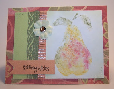
Watercolor pear
Some stampers keep a file of UFOs (unused flat objects), which is where those images you stamp, maybe even color, but don't end up using, find a home for a long, long time. That's where this pear has been living for quite a while, but it worked perfectly for this layout. The sketch is Card Patterns #170, and I am also entering this for Victorine Original's challenge #36, which has the theme of "Anything goes".
To create the pear, I scribbled on the stamp with watercolor crayons, spritzed the stamp with water, then stamped on watercolor paper. I use the word "scribble" but it wasn't random; I put the colors where I wanted them to be to give the pear the look I wanted.
As you probably know, watercolor is bright white, so when I decided to go with this paper, I sponged around the pear with Versacolor "Bamboo" ink to tone it down. (I sponged a white Prima with the same ink to create the matching flower).
The papers are all from a K&Co. stack called Bungalow.
Other supplies: Jeweled brad, ribbon, piercing tools, birthday sentiment.
Truth be told, this is a lot more color than I usually work into one card, and it's a little scary for me to use that much color. I do like how it came out -- hope you do too.
Thursday, June 7, 2012
Not too girly, I hope
When I first tried this card, I used the biggest circle nesties I have for the half circles, but they weren't nearly big enough. I ended up going old school -- tracing circular objects and cutting them by hand. I figured the scallop scissors would disguise the less-than-perfect cuts.
The sketch here is Card Patterns Sketch #168. The card is also for There's Magic In the Air's three in a row challenge -- the blog posted a 3-by-3 grid with each square containing a different element; we have to pick three in any tic-tac-toe-style line. My line is lace, flowers and brads. ( I assume the flowers in the image count!)
The details:
Stamp: Hero Arts
Ink: Chestnut Roan chalk
Patterned Paper: Stampin' Up.
Lace and brads, unknown.
Friday, May 11, 2012
Flowers, flowers everywhere
How many floral images do you have? I have no clue how many I have, I just know I am drawn to them and have to remind myself that I have plenty of flower stamps when I see another I like. I also like floral printer paper and flower embellishments, so the Victorine Originals challenge #33, with the theme of '"flowers" seems like it was made for me.
I started with floral paper for the base card. For the central image, I inked up the flower with Colorbox Chalk ink called Cadmium Yellow and stamped it off once on scrap paper before stamping it, so I got a lighter image. I overstamped with the sentiment in black Memento ink and sponged the edges around it with a greenish color called Bamboo. All the papers are from a Making Memories stack called Sydney.
For the embellishment, I used two layers of gauzy flowers under the paper flower both to make it fluffier and so the green of the gauze would be evident. They are attached with a mini brad.
Thursday, May 10, 2012
Frog on Vespa
My brother's birthday is coming up. As I've said before, it's hard for me to do "guy" cards. Since my brother and I share a similar sense of humor, I decided to go with this fun image from Paper Cupcakes. How can a frog on a Vespa not strike you as funny?
Frog is colored with pencils and OMS. I used a silver gel pen for the "metal" on the handlebar and hubcabs. I also gave the Vespa a coat of spica pen to give it a sparkly, clear-coat look. (I had a car with metallic blue paint once. It was about that sparkly when it was new.) That's as far as embellishments go for this "guy" card.
The tickets are also from Paper Cupcakes; I chose a bunch of "have fun" sentiments and left the birthday greetings for inside the card..
The sketch for this is the current sketch for Card Positioning Systems, CPS 264.
Friday, April 27, 2012
Masculine birthday card
There are lots of birthdays coming up in my family, so this card will go to one of the guys celebrating. I used this week's sketch from the Card Positioning System Blog, CPS262.
The tiger (from Raindrops on Roses) is stamped in Colorbox Chalk chestnut roan ink; I did an out-of-the-box cut and cut it with an oval nestie. The sentiment is computer generated, and I didn't realize at the time that the font I chose doesn't line up on the bottom of the letters. That probably doesn't bother most people, but I've spent a fair share of my working life making sure type lines up (among many other picky details, of course), and it does bother me.
Papers are all from a ridiculously old pack from DCWV, which until I made this card had been used exactly once. I must use up old supplies!
The embellishment is baker's twine strung through a spacer bead that sort of vaguely looks African. It's so hard coming up with good embellishments on masculine cards. What sort of embellies do you use on a card for a guy?
Tuesday, April 24, 2012
Another rose card
The subject of this week's Teapot Tuesday challenge was tattoos. I prefer my ink on my fingers and my stamps rather than on my body, thank you very much, but I thought a rose would make a nice tattoo, so I created this card. I used the current Card Patterns sketch (#162) for the layout
The stamp is one I picked up at a stamp show in a bargain bin. It's inked in Memento black and colored with pencils. The ribbon is from a grab bag of stuff I bought at a stamping consignment sale on Saturday; the ribbon is from Elements, and someone on SCS pointed out it looks kind of thorny.
Instead of the buttons the Card Patterns sketch showed in the lower left corner, I just did a little paper piercing, because I didn't want to clutter the card too much, and I do like this image a lot; didn't want to take attention away from it.
Monday, April 23, 2012
Time to start thinking about Mother's Day
This time of the year is a busy one for birthdays and holidays in our family. I decided to use the Really Reasonable Ribbon Challenge (RRR46) as a jumping off point for a Mother's Day card, since I know I need to make one. The challenge was to make a card with black and white and one accent color. I chose red.
The rose square is from Zim Prints, which I think is a long-gone stamp company. I used to love stopping by their booth at the stamp show, and they haven't been at the show for years. The actual stamp is larger, and I trimmed it down to fit. Roses were inked in Memento Black and colored with pencils. I added some spica pen accents to give them a little shine because they looked kind of flat.
Sentiment is computer generated and accented by some red gems. The strips behind the rose images are ribbons -- two strips of a narrow red ribbon and one strip of a wider black and white gingham. They also add a little sparkle and texture to the card.
I'm off to make masculine birthday cards now.
Thursday, March 29, 2012
Going International
My house was actually quite bilingual for the last few weeks, as we played host to a German exchange student. He was a very nice boy, and a very talented musician, and it was quite interesting to get to know him.
That's my lead-in to a card honoring France -- it's the best I could do, aside from noting that this week's Teapot Tuesday Challenge was all about France. I used the current Card Patterns sketch (#158) to create my card, and I ended up making it an odd size, to fit what used to be known as a "letter envelope" or roughly 6 /14 by 3 1/4 inches.
The Eiffel Tower is black-embossed on white card stock, with blue ink (SU Blue Bliss) sponged pretty heavily around the edges. The sentiment is also black-embossed.
I had seen a really cool embellie made with a button and twine, looped to look like a flower, on a card at SCS. That inspired my odd little blue and white embellie here -- it's not as nice as the inspiration, but it is an interesting little do-hickey, and it let me get a little blue down at the bottom of the page.
Tuesday, March 27, 2012
CAS not so simple for me
Clean and simple doesn't normally come naturally to me, at least when it comes to card making. My husband always says I'm a "minimalist" but it doesn't seem to translate to cardmaking, where I agonize over everything.
Not this time, however. The challenge for There's Magic in the Air was to make a "less is more" or CAS card. I used the CAS sketch challenge from SCS, and this card came together in record time.
The branch (Autumn Leaves)is stamped in versamark and the sentiment (source unknown) in SU Mauve Mist. Two of the butterflies were punched from a scrap of printed paper, and the green panel is mounted on the same print. I'm not sure the purple butterfly is the perfect color, but all in all, I'm pretty happy with this quick card.
Friday, March 9, 2012
Not a shamrock in sight
This tag is for two color challenges, the Monochromatic Green at Really Reasonable Ribbon (RRR43) and Green, White and Black at Victorine Originals (VO29). I know when someone suggests green cards in March, you're supposed to do St. Patrick's Day, but I have no appropriate images and don't really get inspired by leprechauns (no offense to those who do -- I have seen plenty of fabulous St. Patty's Day creations!).
I decided to make an Asian inspired tag instead. The images are from Hero Arts and Inkadinkadoo.
The bamboo is clear embossed on the green tag. I stamped the lanterns on a multicolored paint chip (so I could get several greens that worked together), cut them out and strung them on baker's twine. The symbol/sentiment is matted on black and placed on top of a piece of ribbon that I folded into a point. The black ink is StaZon on the lanterns and Memento Black on the other. The edges of the tag are sponged with Versacolor Bamboo ink. I added a green eyelet and tied a variety of green ribbons and fibers to it.
Thursday, March 8, 2012
Butterly on vellum
When I planned out this card, it was going to be black and white with a pop of colored vellum. But the B&W paper I planned to use didn't work, and I found this in the same pack. So ... the card sort of went in a different direction. (Isn't that what stamping is all about?)
This is the current Card Pattern Sketches (CPS255) layout, although I made it vertical instead of horizontal.
Image is by Inkadinkadoo. It's stamped and black-embossed on an orange vellum that's matted on white. The printed paper is from Making Memories. Silk flowers and orange mini-brads finish it off.
Tuesday, March 6, 2012
Sort of a collage
I really shy away from doing collage, but this card sort of ended up collage-like. It's not quite what I envisioned when I started, but I'll call it a learning experience. I did end up using some materials that are a little unusual.
The sketch for this is the current one at Card Patterns (#155). I stuck pretty close to the sketch, simply using an oval where they had a circle for the butterfly.
So, what's so unsual about these materials? The butterfly is black-embossed an a paint sample card, and the backgkround is a page torn from a very old thesaurus (one I keep around only for the purposes of crafting.) There's no sponging on that -- that's real live aging. The butterflies are punched from vellum -- not unusual, for sure, but I haven't used any for a long time. Actually the butterflies are two layers thick; they were too pale with just one layer of vellum.
Details: Small butterflies by Impression-Obsession, large one might be Stamps On Fire. Martha Stewart Seam binding,
Tuesday, February 28, 2012
Life is a beach
This week's Card Patterns Sketch (#154) inspired me to do a simple beach theme.
The images are both from Impression-Obsession (I'm 90 percent sure). The larger one is embossed with Winter Wonderland EP, which gives it a nice sort of sparkle, like sand in the sunlight.
The smaller is stamped with Chestnut Roan ink, which is also sponged around the edges of the oval.
The blue strip actually has a linen texture, so it's a little more interesting in person. The ribbon matches the paper quite well and provides a nice feminine contrast for the kraft paper and brown ink. It also qualifies this card for the current Victorine Originals Challenge (#28), to use lace on your card.
Friday, February 24, 2012
You've got style
I made this card a few days ago and forgot to post it until now. It's been another crazy week, with the car in the shop (again), which always throws me off my rhythm.
I made this for Really Reasonable Ribbon's current challenge, (RRR #42), use pink and brown. It's a great color combination. I used a couple of challenges at SCS as a jumping off point -- the sketch is from the sketch challenge, and I used a decorative edge scissors to meet the Ways to Use It challenge requirements. It was a good reminder of why I don't usually use decorative-edge scissors -- it's too hard to cut straight (even though I draw a line to cut along) and the corners always come out funny.
The details of this card:
Dress form images from Lost Coast; sentiment from Endless Creations. The dress forms are paper pieced with some SU polka-dotted paper.
Ink is Colorbox chalk Chestnut Roan.
Embellishments are pink velvet rickrak and a varigated brown ribbon.
Tuesday, February 21, 2012
Birthday Fun
Like most stampers, I assume, I have lots of birthday images and sentiments, because I make a lot of birthday cards. So I was delighted to have a chance to use some of the smaller images with this layout from Card Patterns (sketch 153). Even better, this is for Teapot Tuesday at SCS, which is collecting birthday cards the staff of a children's hospital can give to kids who are in the hospital on their birthday. The collection is the idea of a 9-year-old who was in the hospital for serious surgery and wanted to thank the staff. Don't you love it when kids do that?
Each image is clear embossed and punched with a one-inch square punch. I alternated images and bright blank squares because I thought too many little images would just be distracting. To be clever, I used baker's twine as a string on the balloon (the stamp is wierdly stringless, and I wanted to be sure kids knew what it was). Normally I wouldn't use black on a kid's card, but it really brings out the brights and that way I didn't have to worry about additonal colors clashing with the squares.
I'm not even sure where most of these images come from. The cupcake and sentiment are from Clearly Defined, the others are random unmounteds. The inks are all from Colorbox's Petal Point Primary Colors (pigment ink) and are clear embossed.
Tuesday, February 14, 2012
Salute to Spring
We got a blast of winter today, but no sleet, snow or slush, thank goodness. In hopes of enticing spring to come back, I have a very spring-like card today.
Daffodils are already in bloom here, thanks to the mild winter, so tulips should be the next up. This lovely tulip stamp is from SmArtWorks. I like the more subtly shaded tulips, so mine here are white with pink at the base.
I used the current Card Patterns sketch (#152) for this card. The color scheme comes from There's Magic in the Air, which challenged us to use pink, white and another color -- green, in my case.
The sentiment is from CTMH and is stamped in Baby Pink ink. The pink patterned paper is an old Stampin' Up set.
Hope your day is wonderful, no matter the weather.
Saturday, February 11, 2012
With a flourish
I guess flourishes are still "in," because I do see them a lot as a way to use bling, but I haven't really thought about using flourishes for a while. One of the Virtual Stamp Night challenges at SCS was to use swirls or flourishes.
As soon as I saw the challenge, I knew I wanted to use this bird by Inkdadinkadoo. I had seen it used on a card somewhere in the last few days, so it was fresh in my mind. I usually use the larger birds from this set, so it was good to put some ink on this.
I used the Mojo Monday sketch (MOJO227) as the basis for this card. The bird is stamped in Ranger Denim ink, then clear embossed. I also sponged the denim ink around the edges of the oval and on the top silk flower to done down the white.
The papers are from Stampin Up and the lace is a paper adhesive lace from K&Co. (I love this stuff; got it at Tuesday Morning and would grap another package if I found it anywhere.)
I'm really starting to like the look of monochromatic cards. What do you think?
Friday, January 27, 2012
Inspired balloons
This week's challenge at There's Magic in the Air asks us to be inspired by this bright and cheerful photo. I loved the greens and purples and wanted to be sure to incorporate them into this card.
I even found a Paper Cupcakes image that works well with this inpiration. It's called (surpirsingly enough) Balloons with Envelopes.
I used this week's sketch from SCS, and there's nothing that needs explanation on this card.
The details: Image by Paper Cupcakes; papers by Martha Stewart. Image colored with pencils and OMS. Accessories include Beads in a Bottle, decorative-edge scissors and skinny ribbon.
I'm also entering this in the current Victorine Originals Challenge, which is "anything goes," so I'm pretty sure this qualifies.
Paper Cupcakes inspiration photo |
I even found a Paper Cupcakes image that works well with this inpiration. It's called (surpirsingly enough) Balloons with Envelopes.
I used this week's sketch from SCS, and there's nothing that needs explanation on this card.
The details: Image by Paper Cupcakes; papers by Martha Stewart. Image colored with pencils and OMS. Accessories include Beads in a Bottle, decorative-edge scissors and skinny ribbon.
I'm also entering this in the current Victorine Originals Challenge, which is "anything goes," so I'm pretty sure this qualifies.
Tuesday, January 24, 2012
Bluebird of Happiness
I had to make a monochromatic card, and I used the current Card Positioning System sketch (CPS252) for the layout.
This card is pretty self explanatory. The bluebird image is clear embossed. I hand-sewed the lace to the ribbon because it seemed like the easiest way to make sure it stayed where I wanted it to. The silk flowers started out white and I sponged blue on them to fit the theme.
The details: Stamp by Inkadinkadoo. Papers by Stamping UP. Ink is Cobalt Blue and SU Bliss Blue. Accessories include nesties, brad, lace, ribbon, and clear EP.
Monday, January 23, 2012
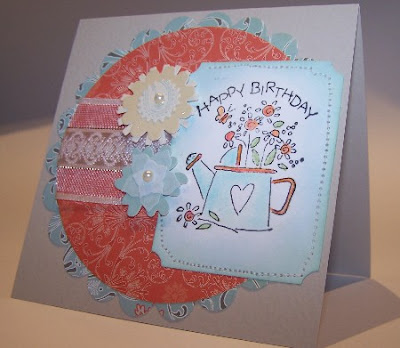
Happy Bday
This week's sketch at Card Patterns (#149) called for a circle card. I had to make a birthday card for my sister-in-law, and a circle card just seemed kind of small (based on the nesties I own), so I used the sketch and put it on a square card (like one of the DT did).
My SIL enjoys gardening, so I did a gardening theme. The wide variety of different stylized flowers on this card really strikes me as sort of funny, but I think the common colors make them all work together OK.
The stamp is from a very old SU set, and it's fun to give it new life occasionally. Image is colored with pencils, and Colorbox Ice Blue ink is sponged around the edges. The panel is sewn onto the card. The Nestie circles feature Cosmo Cricket paper, flower embellies are from a yard sale bargain box, and the super wide ribbon is from Offray.
Subscribe to:
Posts (Atom)
Stems and flowers
I love these Tim Holtz flowers, and decided to use them for a CAS card. The card is a mini slimline. The All that was left of the snippets...
Popular Posts
-
I tried the acrylic block technique -- just take an acrylic block, apply some ink, spritz with water, and apply to paper. It creates an...
-
Kayaking is a favorite vacation activity of mine, but I don't have a kayak stamp so I went with a canoe. The image is black embossed o...
-
Sometimes you just want a lot of color. I used a ton of snippets to die-cut flowers and greenery, then arranged them into a wreath. Added ...