This card went through a tremendous amount of changes from idea to completion. I changed sketches, backgrounds and sentiments. But I'm pretty happy with it. I like doing Father Christmas in something beyond the typical red. Why not blue, it's my favorite color.
The details:
Santa (an old Hobby Lobby stamp) is colored in pencils, and Creamy Caramel is sponged around the edges of the oval.
Both blue and brown layers are embossed with a music score folder. I sanded the blue embossed piece of Coredinations paper to better reveal the design.
The awesome crocheted lace is a yard sale find.
Believe stamp is stamped in Night of Navy, sponged with caramel ink and layered on an offset bit of blue paper. There is also caramel ink sponged around the edges.
The sketch for this is the 365 Card's weekly sketch (day 293, if you are keeping up. Gosh, less than 70 days left this year).
This card is also for these challenges:
Simon Says Stamp Wednesday Challenge -- Christmas
CRAFT Challenge 229 -- Christmas
Word Art Wednesday 102-- Anything Goes
Rubber stamping, stamping, papercrafting and other projects from a writer by trade, stamper by passion.
Showing posts with label 365 cards. Show all posts
Tuesday, October 22, 2013
Friday, September 20, 2013
Thinking towards Thanksgiving
Well, give me a taste of fall and my imagination runs wild. This week it ran all the way to Thanksgiving, so I made a Thanksgiving card.
The main image is on a piece of kraft cardstock. I was going to try a sepia technique (from the Technique Junkies Newsletter. I saw a Christmas card using the technique at the Holly Jolly Christmas blog and I loved it), but I just couldn't make it look right. It's supposed to be mainly white highlighting, and I just wanted to add more color, so I went my own way and added color. The center of the sunflower is covered with brown flocking, and I just love running my finger over it. I'll probably wear the flocking off before sending the card out.
Details:
Stamps: Mark's Finest Paper
Ink: Memento Tuxedo Black, SU Creamy Caramel (sponged on edge of main image)
Paper: all from a very old stack, either ProvoCraft or DCWV
Accessories: Flocking, colored pencils, OMS; ribbon
I'm entering this card in the following challenges:
Tammy's Scrapping Corner #80, Anything Goes
Challenges 4 Everybody #29, Anything Goes
365 Cards, Day 263, Garden Scene (it's a fall garden scene)
Word Art Wednesday #98, Anything Goes
Wednesday, May 29, 2013
Celebrate
CASual Friday challenge (CFC102) is to do a red-white-blue card, so I'm looking forward to the Fourth of July. I love fireworks and our town has a lovely fireworks show every July.
The fireworks are embossed with a glittery white EP (It's called winter wonderland, but here we are going to call it Fireworks Sparkle). The star is a wooden embellie I colored myself. I just pressed it into a pad of Colorbox Lipstick Red ink, then layered some paper glaze on it to give it a shine.
And that shining star makes this the perfect entry it 365 Cards Challenge Day 149, where the Wednesday word is "shining."
Monday, May 6, 2013
Happy Bday, bro
May is a big time for birthdays in my family, so I crank out a lot of birthday cards in the spring. Most of the birthdays belong to guys, so I'm always trying to come up with something that can pass the masculinity test.
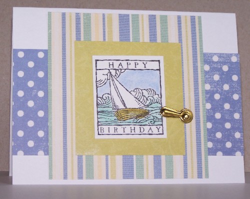
Sailboats qualify as masculine, right? Hope so, because this one is for my brother. It's from an old SU set called Wonderful Woodcuts. I used the Sunday Sketch from 365 Cards (Day 125). The papers are all from a Making Memories stack, and I tried to find colored pencils that coordinated pretty well to color the image.
Metal embellies always seem masculine, so I added a photo turn.
Friday, May 3, 2013
An unusual embellishment
Every once in a while, a challenge just seems tailor-made for a specific card. This one, for example. Challenge #122 for 365 Cards is called "You Used What???" I used part of a belt.
The belt is made of interlocking loops, and it was simply too long. I realized I could just cut off a couple of the loops without hurting the rest of the belt and get it to a better length for my needs. After snipping off the leather (or probably pleather -- it's from Kohl's), I put them on my craft table. When I decided to craft a little purse as an embellishment for this purse-themed card, I saw the belt remains laying there. I cut one of the loops and used it as a handle on the tiny handbag.
The stamps are from Purple Onion Designs. On the inside it says something like "too many purses, too many shoes or too many awesome friends." Papers are by Heidi Grace.
The strangest thing I have ever seen used on a card was part of a chicken bone. A woman in a Yahoo group I'm in posted a picture of that card. What's the weirdest thing you've seen on a card?
The belt is made of interlocking loops, and it was simply too long. I realized I could just cut off a couple of the loops without hurting the rest of the belt and get it to a better length for my needs. After snipping off the leather (or probably pleather -- it's from Kohl's), I put them on my craft table. When I decided to craft a little purse as an embellishment for this purse-themed card, I saw the belt remains laying there. I cut one of the loops and used it as a handle on the tiny handbag.The stamps are from Purple Onion Designs. On the inside it says something like "too many purses, too many shoes or too many awesome friends." Papers are by Heidi Grace.
The strangest thing I have ever seen used on a card was part of a chicken bone. A woman in a Yahoo group I'm in posted a picture of that card. What's the weirdest thing you've seen on a card?
Tuesday, April 9, 2013
Flying free
Between travels and houseguests, it feels like I haven't made a card in ages. I finally got to make one today, and I was inspired by the cheerful spring colors and images in the photo inspiration for The Alley Way Stamps Be Inspired Challenge #25. For the layout, I used the Sunday Sketch from 365 Cards (challenge #97).The butterflies are paper pieced with the same dotted paper I used for the framing panel. I added a double row of rick-rack and used a border punch along the bottom of the panel.
Stamps are from The Alley Way Stamps (go to the website, where they have a freebie image every month, incuding the butterfly). Papers are Heidi Grace and Stampin Up.
Thursday, March 28, 2013
Spring is in the air
The in-laws left this morning, and I immediately headed to my craft room to have some play time. (I enjoy both of them, but I think they'd freak out if they saw the mess I can create in making just one card. I don't craft when they are visiting.).
I was inspired by the colors of this week's Play Date Cafe (#175), buttercream, lavendar and vanilla. Those lovely pastel shade just seem so springlike, and I am really ready for spring. By this time of year, the dogwoods and azaleas are usually breathtaking, but this year they haven't even started to open. The cold and wet weather seems to be moving out, tho, so let's celebrate spring.
The card is pretty self-explanatory. The pale lavender panel is embossed, the flowers are colored with pencils, and the white panels are sponged on the edges with one of my favorite colors of ink -- VersaMagic Pentunia. It looked like a lot of ink when I sponged it one, now it looks very subtle.
In addition to Play Date, this one is for CCEE1313, to use a stamp you haven't used in at least six months (the flowers probably haven't seen ink in two years); and 365 Cards day 86, inspired by the word "country" (gingham always seems country to me).
Thursday, March 21, 2013
inchies
Day 77 of the 365 Cards challenge calls for inchies. I took a slightly different twist on this challenge. Instead of using separate one-inch squares, I cut my image into one-inch squares, like tiles. (I did learn it's not that easy to put them back together all nice and straight. At least when you're tiling the bathroom you can use those little plastic bits to make sure you're spacing correctly.)
Images are both from Stampin Up. I added a few half pearls to the sentiment panel.
Wednesday, March 6, 2013
Sponge(d) cake
You can never have enough birthday cards around, can you? Here's CAS one I made.
To create the design on the base card, I sponged the circles using a stencil I have. Unfortunately, I noticed after I'd done the sponging that the last row of dots on the stencil is not evenly spaced. Not happy about that, but I guess it's proof it's handmade. The colors are SU Cameo Coral and Night of Navy, and Memories Soft Leaf (a shadow ink).
The image is from Impression Obsession, also stamped in navy. The coral strip is embossed with the Swiss dot folder.
The sketch is from Retro Sketches, #53. The sponging counts as creating wallpaper for CAS-ual Fridays, CFC92. And a couple challenges are for birthday cards: CAS on Sunday #3, birthday card, and 365 Cards Day 63, birthday cake.
Friday, February 8, 2013
You hoo
For the longest time, I used to buy random patterned paper just because it was pretty. Then I'd have the hardest time using it with any other paper, because they just didn't go together, so I never used more than one print per card. Finally I wised up to paper packs. Well, duh, huh?
This card uses four different patterns that all work together, thanks to the wonder of paper packs. I think this is an old Stampin Up set of papers -- I'm sure someone recognizes it.
The layout is the weekly sketch from 356 Cards (#34). The owl is from Inkadinkadoo, and the sentiment is from Hero Arts (also from an owl set). Both are inked in Colorbox Chalk chestnut roan -- I stamped the sentiment several times, but it insisted on being light.
Wednesday, January 30, 2013
What's black and white and red all over?
![]() |
| 365 Cards #27 |
![]() | |
| Retro Sketch 48 |
The second card, the horizontal one, uses Retro Sketch challenge #48. The doodling on this is a little different -- I was going to doodle squiggles for the three little strips, but this patterned paper really matches the image and worked too perfectly. I used the organza ribbon again, this time tied onto a heart-shaped clip. There is piercing all around the edge of the red panel. The sentiment is straight off the computer printer.
Tuesday, January 8, 2013
I heart 2013
Time to get started on crafting for the new year. A COTM group I am in has the theme of fiber for this month, and we're supposed to do something more than just tie a bow with it. I ended up wrapping my fiber around a chipboard heart. I actually like the effect. The fiber is like velvety, like chenille, and has patches of glittery threads in it. I got it in a fiber swap back when fibers were all the rage, and just stumbled upon it in my stash when working on this challenge. Don't you love it when stuff from your stash jumps out at you and works perfectly?
The layout is Feeling Sketchy #41. This is also for 365 Cards #2http://feeling-sketchy.blogspot.com/2013/01/feeling-sketchy-41.html, to do a Valentine's card, or at least to use a heart.
The patterned paper is from Cosmos Cricket. Sentiment is Hero Arts, done in Memento black.
The layout is Feeling Sketchy #41. This is also for 365 Cards #2http://feeling-sketchy.blogspot.com/2013/01/feeling-sketchy-41.html, to do a Valentine's card, or at least to use a heart.
The patterned paper is from Cosmos Cricket. Sentiment is Hero Arts, done in Memento black.
Wednesday, December 12, 2012
Pierced frame
Pierced frames are a quick and easy way to add interest to a card. To create the frame for this image, I just cut a scrap piece of paper to the size I wanted, then used a corner rounder on the edges to create an interesting shape. Use low-tack tape to hold it in place and pierce around it.Olive green and red is a little twist to the traditional Christmas colors, making them look a little more contemporary and fun. Red and green are complementary colors, or opposites, so this is being entered in 365 Cards challenge #285, to use "opposite colors."
The tree is a die-cut sticker. Actually, there were three slightly different versions of the tree on the sheet of stickers, so I made three versions of this card, because I think it's fun.
Tuesday, December 11, 2012
a more elegant Christmas
White-on-white embossing always strikes me as quite elegant, and I hope it adds a touch of that to this card. I added a few pearls to increase that feeling.
This card is based on this weeks sketch for 365 Cards, #284.
The ornament is an extra from a previous card I made. I silver-embossed the sentiment and cut it out with nesties. (My standard "Merry Christmas" stamp was an old cheapie. It wasn't stamping properly and I thought it was warped so I decided to unmount it. It literally cracked and fell apart while I was trying to get it off. I guess the rubber had dried out. That has NEVER happened to me before, and now I have to head out to find another one).
I used the textile embossing folder to give the background a little dimension and a pattered ribbon to add a little more color.
Sunday, December 9, 2012
Splattered and tied
The COTM theme for a group I'm in is "paint splatter technique." Calling this a technique is a bit of a stretch, since all I did was mix a little water and reinker, load up a paint brush, and flick it. I guess it makes an interesting background -- easy enough to do, and you could make bg paper any combo of colors you wanted to.
The tree is embossed with a glittery white EP called Winter Wonderland. It looks quite glittery in real life.
I used a scrap of the paint-splattered paper to make a tiny tag for my sentiment, and a scrap of embroidery thread
The card is for 365 Card challenge #279, to use gingham. I think the gingham ribbon goes will with the casual look of the paint splatters.
Tuesday, December 4, 2012
For all the Whos in Whoville
A few weeks ago, the Technique Lovers Challenge at SCS was making a folded tree. Couldn't be simpler -- you take half a circle and put three folds in it, and you're done. I made several of them that day, figuring they'd be useful on Christmas cards.
Sure enough, those trees are proving handy to have around as I make Christmas cards. This one fit perfectly into this week's sketch at 365 cards #277.
There's something about the trees I made that makes them look a little Seussical. I think they'd be perfect for Cindy-Lou Who, don't you? (Actually, I suspect they would also look quite elegant if done in an embossed white, and I need to try that). I happen to have a pad of Christmas dp someone gave me that also has that sort of Seussical feel to it. Personally, I like my Christmas stuff traditional, so I've been struggling to use this paper in ways I can live with. I think the little Whoville tree card with the whimsical circles and squares on the dp actually works pretty well together.
Sunday, December 2, 2012
Little ice skater
Not to rub it in, but there is one nice thing about living in the South.... you can be making an ice skating card secure it the knowledge that right outside your window it's sunny and in the 60s.
I tried a new technique on this -- adding glitter to an embossed piece (just spread it on with a brayer). I must say, it really adds a snow-like sparkle, although I'm afraid it might not show up very well in the photo.
This card is going into several challenges:
There's Magic in the Air -- Sparkle and Glitter
Victorine Originals #48 -- Blue and White
365 Cards #272 -- Wintery with patterned ribbon.
The cute snowman is from Impression-Obsesson. The snowy DP is from Hobby Lobby, I got it last year after using up the pieces I bought the year before. I hope they still have it as I love both the color and the print.
Friday, November 30, 2012
Herringbone Christmas
This card features the herringbone technique, which I learned from the Technique Junkies Newsletter. It's made with 1/4-inch strips of patterned paper (and yes, it's very time consuming). Here's the funny part. I made a 1/4-page sheet of the herringbone about a year ago, using up some scraps of Christmas patterned paper. Then I couldn't figure out what to do with it, and just left in on my stamping desk. Luckily, it didn't get lost or buried too deeply, because a few days ago someone posted a card to the TJ Yahoo group featuring this technique, and I finally knew what to do with it.
I am entering this card for 365 Cards challenge #271, to make a card that is "festive, with green and a circle".
The paper is from a Hobby Lobby stack, which includes some glittery paper. Sentiment is from Serendipity. I got the little holly leaves in a scrapbook kit, and used mini red stubs and green ribbon from my stash.
Tuesday, November 13, 2012
Nothing like a cup of cocoa
This is a quickie I made for the mini VSN held at Splitcoast Stampers over the weekend. The challenge was to make a card featuring a hot drink, and I had just recently gotten this free digi from The Alley Way stamps (It's free all November, so check out her blog).
The layout is from 365 Cards, the Sunday Sketch #256.
This really did go together very quickly. I paper pieced the band on the cup -- I just hand-traced the little band and free cut it. It took a little trimming, but it seemed far more efficient than printing out the whole image for such a little piece.
Wednesday, November 7, 2012
Three variations on a theme
I've really had trouble feeling inspired lately, so it's quite suprising that 365 Cards's challenge #250, to make three cards that are variations on a theme, appealed to me. Maybe I just needed a real challenge, but I jumped on it. The challenge is simply to make three cards that are similar in some way but different in others, with no restrictions on what changes or what stays the same. I ended up keeping the same layout, but changing the image, sentiment and colors on each.
I colored the Iris and the Leaf images with watercolor crayons. I used colored pencils on the other flower image.
Other supplies:
Sentiments: Give Thanks from Mark's Finest Papers; others are from CTMH
Embellishments: half black pearls or mini rhinestones
Nesties: Oval and Scalloped Oval.
Subscribe to:
Posts (Atom)
Not my usual colors
I don't generally use a lot of orange, or pair it with red, but I went in that direction based on the inspiration photo for Beautiful B...
Popular Posts
-
Making these rocker cards is so fun. As long as it can fit in an envelope, you can add any size or shape you want on top of the rocker base...
-
. Another Christmas card in July. This one is a Zfold, with a focus on die-cuts. I combined a tree from one set with gifts from a birthday ...
-
I rarely think to include scoring on my card, but SCS showcased a scoring technique that allows you to create a shaped scored area. (I used...