Showing posts with label RRR. Show all posts

Thursday, March 12, 2015

CAS birthday

Happy Pi Day everyone. (OOps, Judy is right, Pi Day is March 14. Bad info from the DH.)
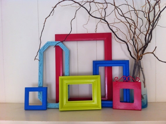
Frame Collage Funky Bright Home Decor Upcycled Vintage Frames Hollywood Regency Apartment Decor Quirky DecorThis card was inspired by the inspiration photo for the Time Out challenge.  The lineup of frames led me to the lineup of vases in this card.
This is as straightforward as a card can be.  Image is from Paper Cupcakes, colored in pencils. Matted and wrapped with ribbon.  The sentiment is from SmARTworks. 
I'm entering these challenge:


Time Out #26-- Inspiration photo
Really Reasonable Ribbons #113 -- flowers
Crafty Sentiments -- Birthday
Ribbon Girl -- Birthday
Word Art Wednesday #174-- Anything goes.

Friday, November 14, 2014

Scoring saves the day

It happens to me all the time -- I  finish the card, then think "this would look so much better if I had embossed that panel." Happened again when I made this card -- that green panel was so flat and BORING, but it was too late to emboss it without possibly tearing everything up. Then I had a great idea -- if I can't emboss it, I can at least score it.  Quick, simple and it made a difference. I really need to remember to emboss more, but now I know I can save some cards with a few score lines; my genius moment for the day.

The card features Prickly Pear stamps and matching die I picked up for a song at the craft consignment sale.  They are stamped in Burgundy and popped up over a panel that features a patterned paper of ornaments. The printed paper actually gives a sense of depth, and with the Pop Dots, this card has some
dimension in real life. The ornaments are "hanging" off burgundy colored cording. The ribbon running under the ornaments says "Merry Christmas" in silver -- it was hard to photograph well.

This card is for these challenges:

Simon Says Stamp Monday Challenge:  Ornaments
Die Cut Divas November Challenge -- Holiday spirit
Crafty Ribbons #106 -- Christmas with Ribbons
C.R.A.F.T. 285 -- Christmas
Really Reasonable Ribbons #106 -- Winter holiday with ribbons
Word Art Wednesday #158  -- Anything Goes


Friday, September 5, 2014

Loving those leaves

Autumn is my favorite time of the year. Of course, here in the Southeast we are a long way from autumn, but at least I know it will come, eventually.
I truly do love leaves as an art element, about as much as I like flowers. I have a good number of leaf images, and over the summer I bought the Spellbinder's Little Leaf set. (Got it from the vendor I worked for at a scrapbooking show -- it's been discontinued.) I also bought a fall-themed stack of 4x6 patterned paper  (K&Co. Tim Coffey Fall Mat pad), so I was ready to tackle a fall card.  Both these items count as Never Been Used Stuff, so I was excited to see Darnell announce her second NBUS challenge.
Since the leaf paper is so pretty, I didn't want to use an image to compete with it; I just used this sentiment from Rubbernecker.
I sat down with my basket of snippet papers and started die-cutting until I had a huge pile of little leaves in various fall colors. I picked out some that complement the pattern paper and used them to embellish the sentiment panel. (You'll probably see others throughout the fall.)  The copper ribbon hides the seam between the two pieces of card stock and gives the card a little shine.

I am entering the card in these challenges
NBUS #2 -- Leaf dies and paper stack are NBUS
Really Reasonable Ribbons #102 -- fall colors and ribbon
Die Cut Divas -- Something new (leaf die)
Whoopsi Daisy -- leaves
Pixie's Snippet Playground 140 -- snippets (all those leaves)


Thursday, June 5, 2014

On the waterfront

Summer is definitely here, and this little waterside scene looks pretty inviting to my eyes.
Here's my attempt at making a masculine card  that will suit for Father's Day or a birthday. The stamp is an old one, and I'm not positive, but I think it is from DRS. It is colored in pencils and cut out with a Spellbinders Label die.
The star is a random little tag I had around. The rim was silver metal, so I used some Ranger alcohol ink to color it brown. Stars seem vaguely nautical, right? After all, sailors used to navigate with the stars. (That's my story, and I'm sticking too it)

I am entering the card in these challenges:

Simon Says Stamp Wednesday, Masculine
Die Cut Divas June, masculine with blue/green/brown/gray
Really Reasonable Ribbon #96, Masculine with trim (baker's twine)
Sketch Saturday #312, choose a sketch (this is Sketch Saturday sketch #304)
Clear it Out, masculine with stars.

Friday, April 18, 2014

Caged Bird

I got this bird and cage die on clearance -- after everyone else was tired of it, probably. This is the first time I've used it on a card and I sort of went all Tim Holtzy, with lots of ink applied DTP and layers of stamping. (Well, OK, Tim would have lots more color and lots more stuff on it....)

For the background, I stamped text in Versamark and applied clear EP on it. (My clear EP is getting a little dirty and probably needs to be replaced....) The edges of that panel are sponged in Creamy Caramel.  The cage and bird were die-cut with cream paper. I applied some copper-colored ink directly on the cage, and added a brown ribbon on top. For the bird, I stamped a music score stamp in Creamy Caramel and a darker sepia and applied the sepia ink around the edges. I also stamped the two layers of white flowers with the musical score.

The card is for the following challenges:

Really Reasonable Ribbon #93, Monochromatic with Ribbon
Crafty Ribbons #85, anything goes with Ribbon
Feeling Sketchy #87, sketch
Simon Says Monday Challenge, Winged Things
Simon Says Wednesday Challenge, Animal Antics
Sister Act card challenge #53, Anything goes.

Monday, July 16, 2012

The good old summertime

I was nosing around a thrift store the other day when I came upon a baggie that appeared to contain some intriguing little gift cards and envelopes. Since the price marked on it was 25 cents, I figured it was worth the gamble to buy it.  It ended up being a really nice score.  Along with the vintage-looking cards (with a copyright of 1995 on the back, so they are only vintage-looking, not really vintage), there were also some cool stickers of vintage-era seed packages. 

The illustrations on most of the cards are portraits, but I loved this one I found of sunflowers, and it made the perfect image for a summery card.  I used Card Positioning System sketch CPS 274 in making this card.

I cut the back of the sunflower card and centered it.  Since it has such a nice vintage feel, I wanted to keep the card sort of country vintage looking. I used bakers twine and a vintage button, along with a snip of ribbon that repeats the sunflower motif.  Swiss dots always add a nice vintage feel, so I embossed the upper layer with that folder.  The script "summer" stamp is from Purple Onion Designs, and is stamped in Colorbox Chalk Chestnut Roan ink.

This card is also for the current Really Reasonable Challenge (RRR52), to showcase summer colors. I'm also entering it in Victorine Originals challenge #38, to use ribbons and buttons on a card.

Monday, April 23, 2012

Time to start thinking about Mother's Day

This time of the year is a busy one for birthdays and holidays in our family. I decided to use the Really Reasonable Ribbon Challenge (RRR46) as a jumping off point for a Mother's Day card, since I know I need to make one. The challenge was to make a card with black and white and one accent color. I chose red.

The rose square is from Zim Prints, which I think is a long-gone stamp company. I used to love stopping by their booth at the stamp show, and they haven't been at the show for years. The actual stamp is larger, and I trimmed it down to fit.  Roses were inked in Memento Black and colored with pencils. I added some spica pen accents to give them a little shine because they looked kind of flat.

Sentiment is computer generated and accented by some red gems.  The strips behind the rose images are ribbons -- two strips of a narrow red ribbon and one strip of a wider black and white gingham. They also add a little sparkle and texture to the card.

I'm off to make masculine birthday cards now.

Friday, March 9, 2012

Not a shamrock in sight

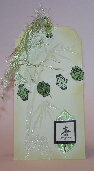
This tag is for two color challenges, the Monochromatic Green at Really Reasonable Ribbon (RRR43) and Green, White and Black at Victorine Originals (VO29).  I know when someone suggests green cards in March, you're supposed to do St. Patrick's Day, but I have no appropriate images and don't really get inspired by leprechauns (no offense to those who do -- I have seen plenty of fabulous St. Patty's Day creations!).
I decided to make an Asian inspired tag instead. The images are from Hero Arts and Inkadinkadoo. 
The bamboo is clear embossed on the green tag. I stamped the lanterns on a multicolored paint chip (so I could get several greens that worked together), cut them out and strung them on baker's twine.  The symbol/sentiment is matted on black and placed on top of a piece of ribbon that I folded into a point. The black ink is StaZon on the lanterns and Memento Black on the other. The edges of the tag are sponged with Versacolor Bamboo ink.  I added a green eyelet and tied a variety of green ribbons and fibers to it.

Friday, February 24, 2012

You've got style

I made this card a few days ago and forgot to post it until now. It's been another crazy week, with the car in the shop (again), which always throws me off my rhythm.
I made this for Really Reasonable Ribbon's current challenge, (RRR #42), use pink and brown.  It's a great color combination.  I used a couple of challenges at SCS as a jumping off point -- the sketch is from the sketch challenge, and I used a decorative edge scissors to meet the Ways to Use It challenge requirements. It was a good reminder of why I don't usually use decorative-edge scissors -- it's too hard to cut straight (even though I draw a line to cut along) and the corners always come out funny.
The details of this card:
Dress form images from Lost Coast; sentiment from Endless Creations.  The dress forms are paper pieced with some SU polka-dotted paper.
Ink is Colorbox chalk Chestnut Roan.
Embellishments are pink velvet rickrak and a varigated brown ribbon.

Friday, November 4, 2011

Gingerbread Newsboys

     A few weeks ago, I saw several cards that used newsprint as one of the design elements. As a former journalist, this really appealed to me, but I kind of forgot about it until this week's Way to Use it Challenge at SCS called for us to use newsprint.  I ended up making a Christmas card that is for both for the current Really Reasonable Reason challenge (#35, Christmas) and the current challenge at Paper Cupcakes' There's Magic in the Air blog (Something sweet).
     Since I knew I was doing a Christmas card, I didn't want the news article to be about Greek debt or anything depressing, so I went through the newspaper looking for a block of newsprint that was both solid type and about a reasonably pleasant subject, just in case the recipient is like me and starts to read the background. (If it's in print, I will try to read it). I really hoped I could find something Christmasy, but settled for a food section article on growing water chestnuts.
        I DPT'd the newsprint with Creamy Caramel ink to make it look aged and so the gingerbread strip would pop.
       Gingerbread border stamp is from DRS. I stamped it in Colorbox Chalk lipstick red, and colored the gingerbread men with colored pencils, dotting in a little green marker on their bowties. Candy cane is from a bag of metal embellies from Michael's, purchased a few years ago.
       What do you think of the newspaper background? The solid block of type works well when you want the background just to be background, as I did here.  I would like to try different elements from the paper (ad pages, classifieds, etc) to see how they look on cards.  Yet another thing to remember when I'm making cards....

Thursday, October 20, 2011

Fall Fun

You're probably sick of me saying that fall is my favorite time of the year. Looking at blogs and other sites, I think a lot of cardmakers are inspired by fall colors and images.  So, I was delighted to make a fall card that fits Really Reasonable Ribbon's Fun 4 Fall theme  (RRR34) and Victorine Original's Fall theme (VO19).
I don't usually do a lot of distressing, but fall seems like an appropriate time for the distressed look.  Two different distressing techniques I learned from Technqiues Junkies came in handy.
I used distressed coloring blocking in yellow and brown ink to add color to the image (which someone sent me as an RAK, so I don't know the origin), and framed the image with a "torn frame." I wrapped the image with gingham ribbon and added a leaf brad before matting it on the frame.
The autumn sentiment is from Purple Onion Design, and I finished the card off with faux stitching.

Tuesday, September 27, 2011

Fall Leaves

     The weather has cooled in the South to where it's pleasant but still doesn't feel like fall. That's a good three weeks off. But fall is my favorite time of year, so I'm enjoying it in stamping if not in real life.  So making a card for Really Reasonable Ribbon's current theme, Autumn, (RRR32) was the obvious thing to do.
     This card was created using the Card Patterns sketch for this week, sketch #134. The leaf stamps are from Autumn Leaves (how appropriate!). Not sure of the origin of the other stamp, it's a foam backed stamped I picked up on clearance at Hobby Lobby. The ink is Chestnut Roan fluid chalk ink, which is one of the real workhorses on my stamping desk.
     Papers are all from an old Provo Craft mat stack, and the burgundy twill ribbon worked well with it. As embellies I added faux stitching, a leaf brad and a punched edge.
     So, I have my fall leaves, and I don't have to rake them up.

Saturday, September 10, 2011

Baby Shoes

     I find baby shoes adorable -- almost as cute as baby feet. So when I saw Really Reasonable Ribbon's challenge (#31) to make a baby card, I wanted to use a baby shoe image.  I really thought I had a stamp of baby booties, but if I do it's lost in the stash, so I ended up just printing out some line art onto a pastel checked/plaid paper, and cutting out the shoe image.
      The sketch is this week's sketch challenge layout from Splitcoast. I embossed the green and blue layers (Swiss Dot seems so perfect for a baby card) and sewed the green layer onto the base card. I added a pastel ribbon and button, and a clear sticker for a sentiment.

Tuesday, August 16, 2011

CAS and pink and brown

     I rarely do one layer cards -- years of stamping have ingrained a desire to do some matting on every card into my brain.  Today, however, I'm sharing a one-layer card. It's about as clean and simple as possible -- two stamps, one ink, a little Flower Soft and some ribbon.
     What has me keeping it so simple?  Really Reasonable Ribbon's current challenge (#30) is to keep it clean. The colors -- white, pink and brown -- are for the Magical Monday Challenge at There's Magic in the Air. Those colors made me think of spring, so even tho fall is (hopefully) coming our way, I went with a spring-like card.
     The tree stamp is from Posh Impressions. The images are stamped in Colorbox Fluid Chalk ink, Chestnut Roan is the color.  The Flower Soft Mix is called Sweet Pea, and I found a ribbon that picked up pinks and greens like in the Flower Soft.
     I usually agonize over cards and where to place things, and it was kind of freeing to keep it to one layer.

Not my usual colors

 I don't generally use a lot of orange, or pair it with red, but I went in that direction based on the inspiration photo for Beautiful B...

Popular Posts